
OverviewProblem
With over 2,700 apparel products, 600 accessories, and 400 hats finding the product shoppers are looking for can be challenging.
Outcome
In our A/B test, +11.53% of shoppers experiencing the new design purchased an item compared to those in the control group.
ClientBarstool Sports Store
Official store of Barstool Sports, a sports & pop culture blog covering the latest news and viral highlights of each and everyday with blogs, videos and podcasts.
InfoRole
Timeline
Lead UX Designer
8 weeks
Team
Me, Katherine Gowin & Joseph Bona
understanding the problemWhy are we doing this?
While endless scroll works well on social media, it is a cause for increased bounce rates in e-commerce. This is especially true when there are hundreds of products to scroll and page through.
1
Improve conversion
Our goal was to visually guide shoppers towards the most applicable brands, categories, or products before they start scrolling.
2
Guide shoppers to other areas
We also wanted to raise awareness and encourage circulation to other collections, categories, or brands within collection page browsing.
data & metricsUnderstanding current site revenue
Looking at all 210 pages, brand collections makeup half of the top 10. This indicates that many of our customers are shopping by brand as opposed to apparel type or city/sports team.
We need to consider how we can make our brand collection pages stand apart from one another, while also keeping consistency so that shoppers can navigate without confusion.

hypothesisBy making top categories and brands easier to find shoppers will spend less time scrolling, reducing the bounce rate and increasing revenue.
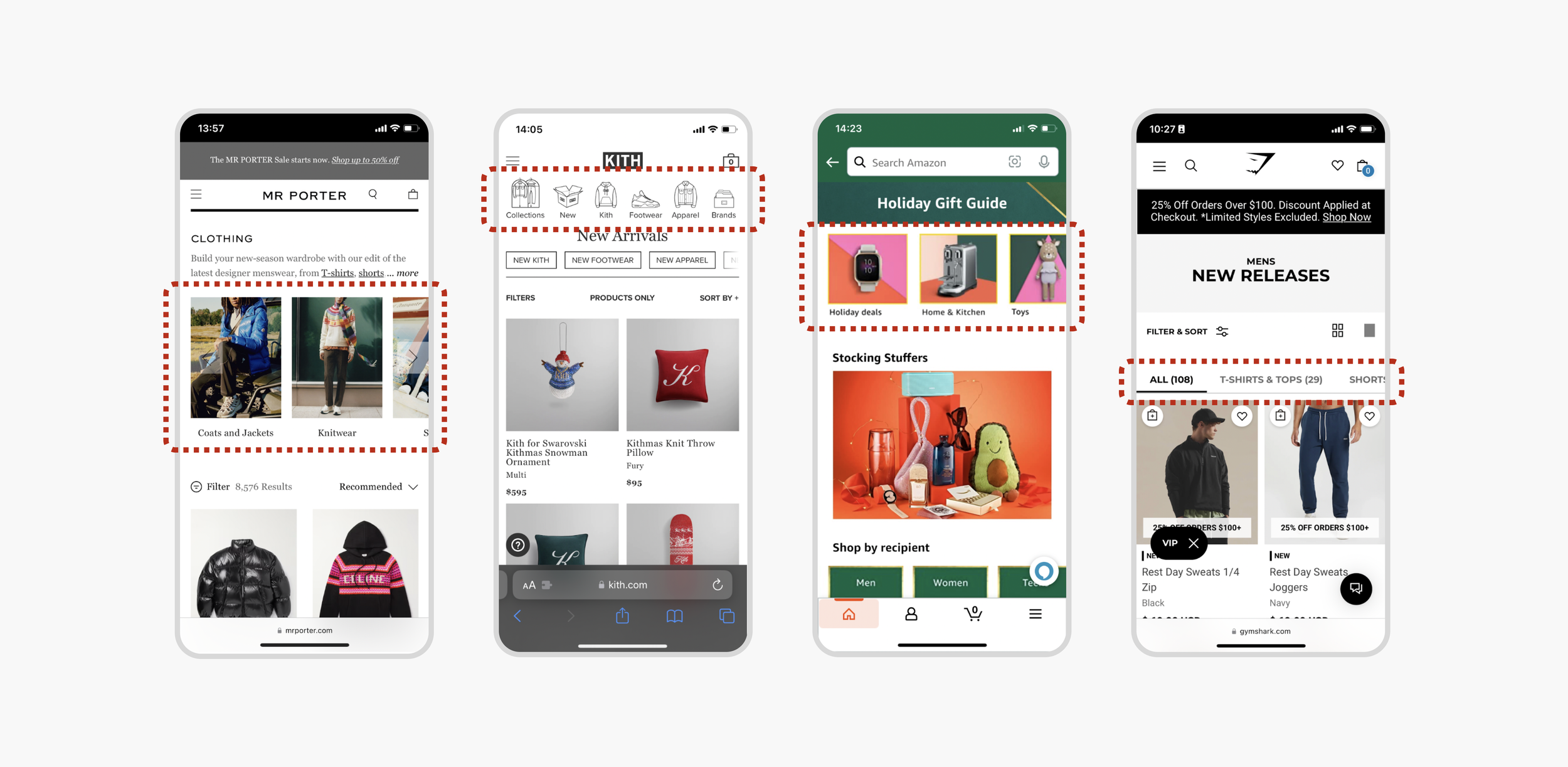
Comparitive analysisIdentifying opportunities
Looking to several of our competitors it was quick to see that an obvious trend was emerging. Most brands had adopted a visual navigation carousel at the top of each page.
While this could be a great solution, and many of the stakeholders pushed for this, I wanted to further understand the existing product before jumping to conclusions.
Site auditEvaluating the existing experience
After further analysis it was clear to me that the current filters available on the site were not functional in a way that customers would expect:
1
2
3
Up to 7 different variations of blue were offered and everything from shoe sizes to shot glasses mixed together without context, making the experience complicated.
Product type
Colour & size
Incorrect product types were displayed where they shouldn’t be (eg. clothing on the accessories page).
Brand
Brand filters did not activate when on brand specific pages making this feature redundant and useless.
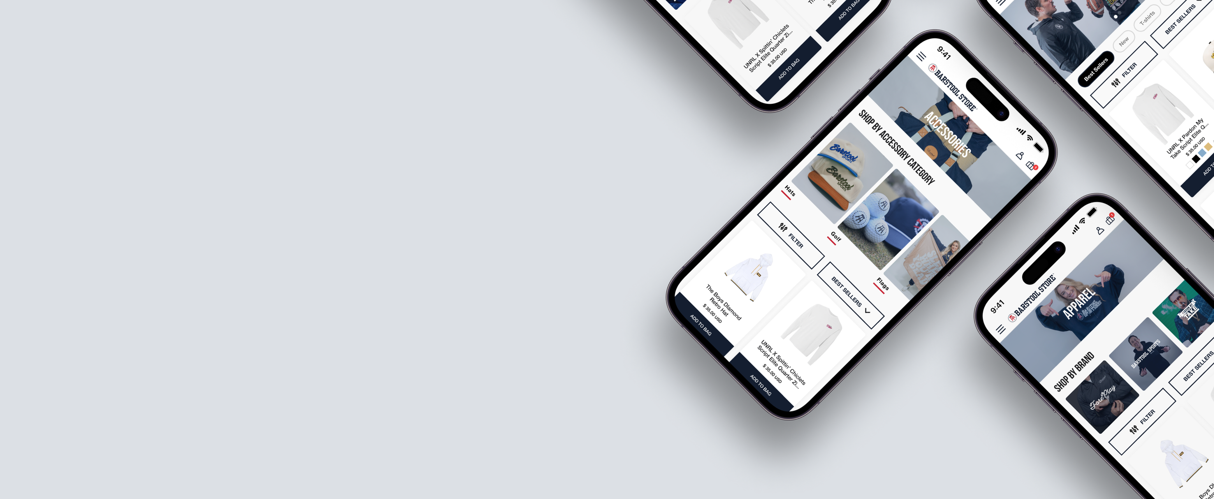
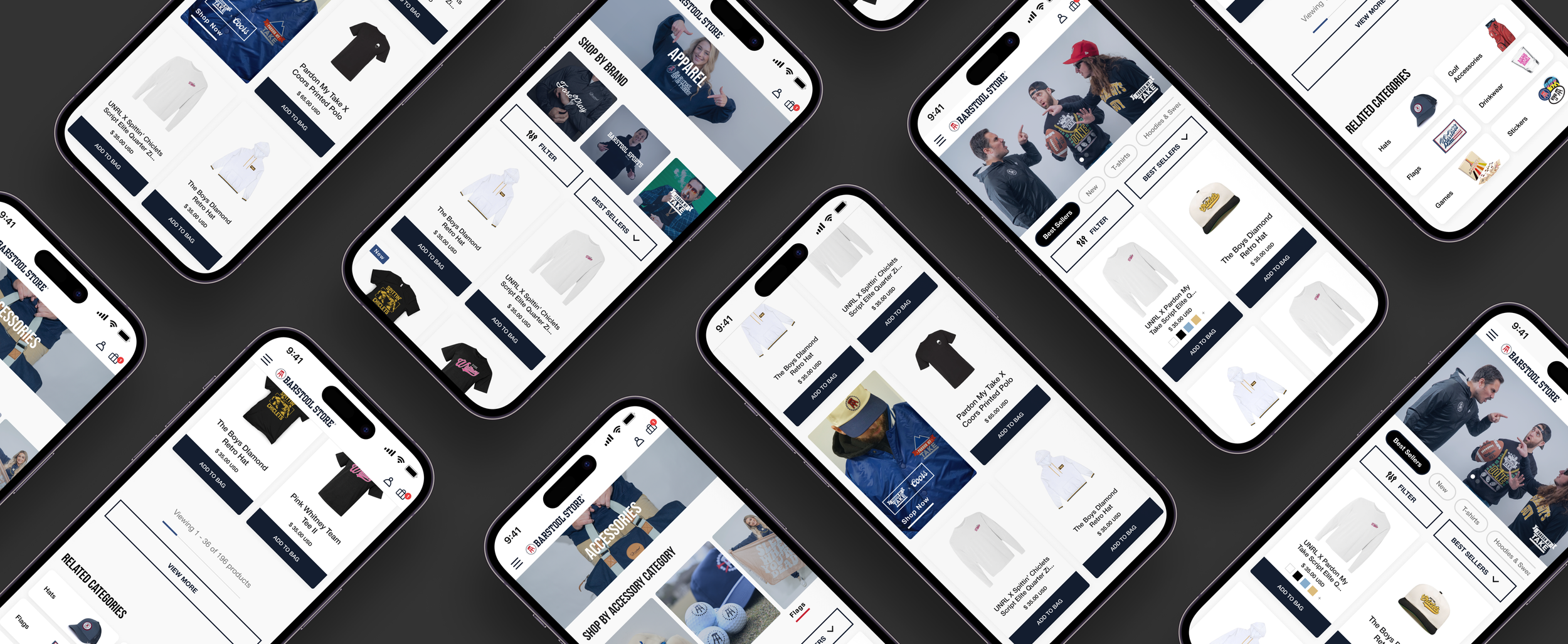
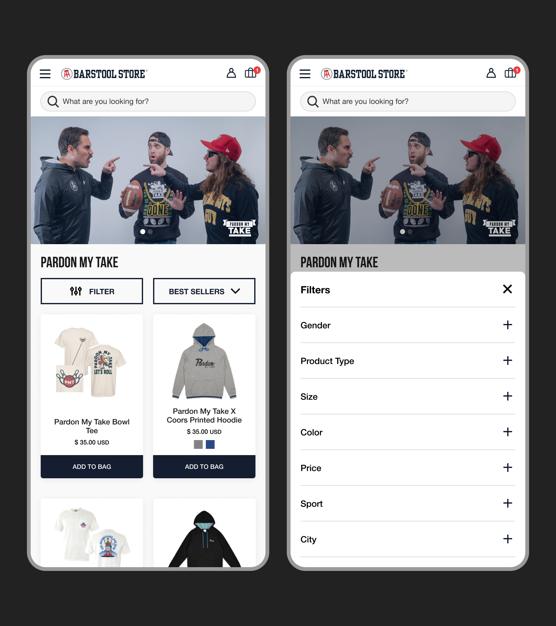
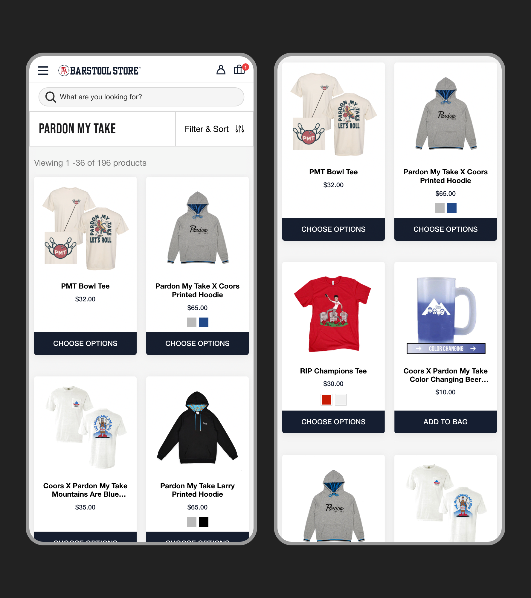
Solution 1Improved navigation & filtering
We needed to make it as easy as possible for shoppers to find the products they were looking for.
Before
Filter and sort options combined and blend in with the page
Filter options are expanded, leaving shoppers scrolling to see available categories
Filter options are limited and ordered arbitrarily
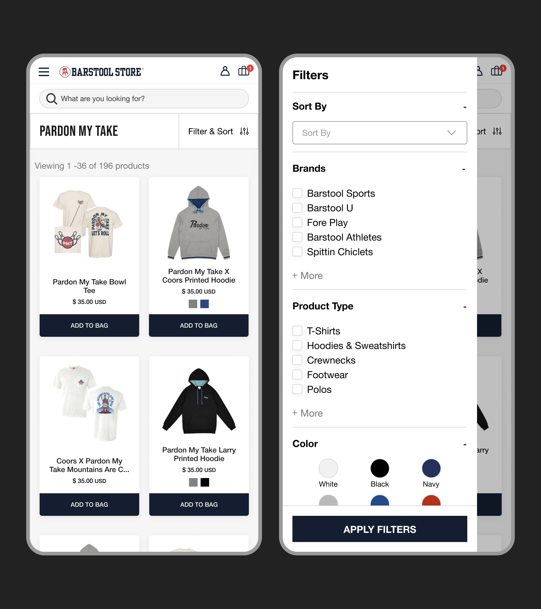
After
Filter & sort buttons are prominent and easy to find
Filter menu defaults to collapsed so that all options are visible immediately
Additional filter options added so that shoppers can further refine their search
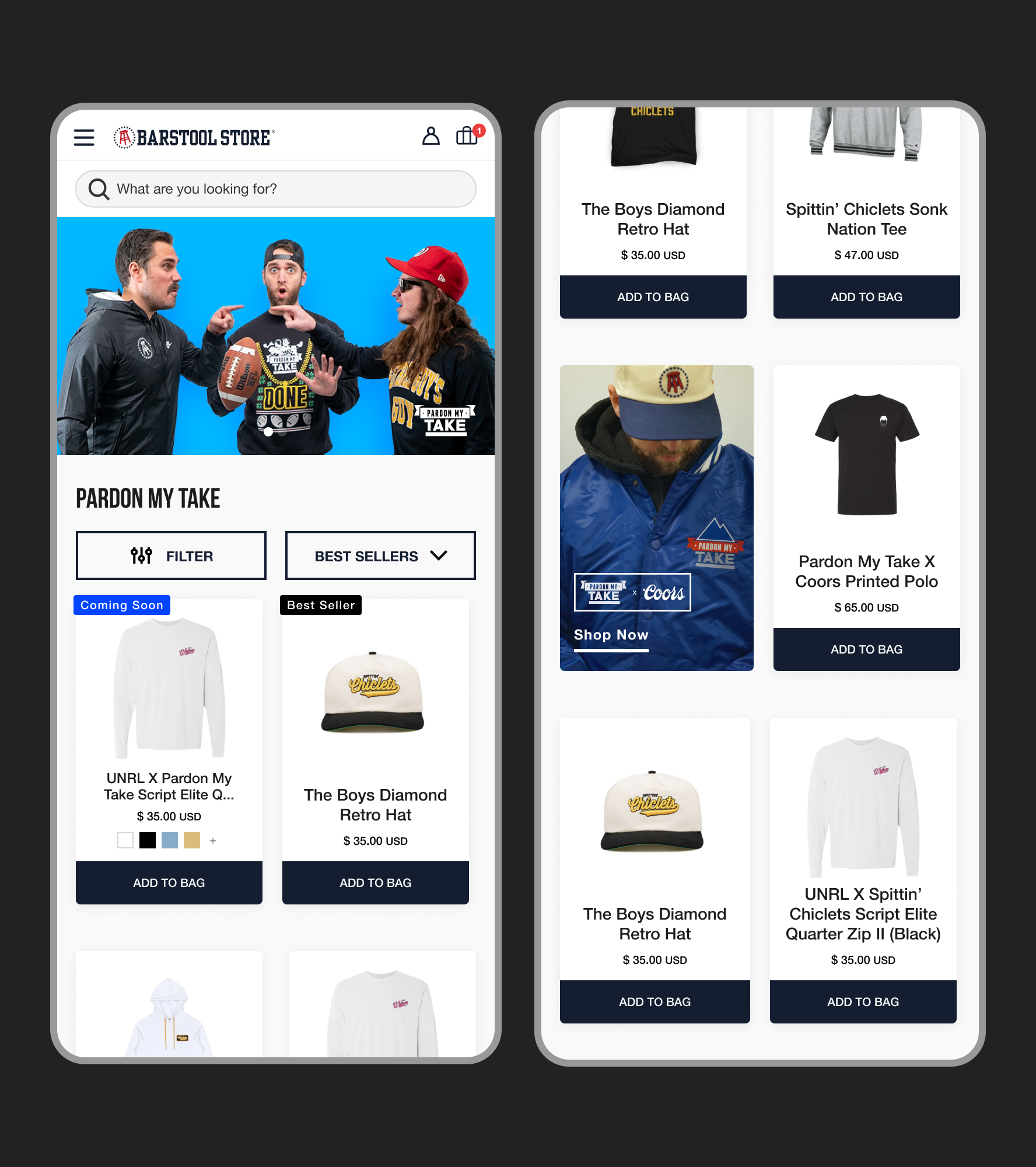
Solution 2Adding voice & personality
On brand pages shoppers can easily scan and know exactly where they are while also feeling more connected with the brand.
Before
After
Page is generic and doesn’t indicate clearly where shoppers are once they have scrolled
Limited edition items and special collaboration collections blend in with the other products
Personalized banners at the top of each brand page immediately direct shoppers
Collection cards every 7 tiles directs shoppers to limited time offers while maintaining the brand tone through the page.
ImpactEvaluating our results
In order to asses if our new design had the impact we expected we needed to check our KPIs that we set ahead of time to quantify our results.
1
2
3
Shoppers were 7% more likely to make a purchase.
Average revenue per session
Conversion rate
ARPS increased 11.53% compared to the control group.
Click rate
30% of shoppers exposed to collection cards clicked on them.
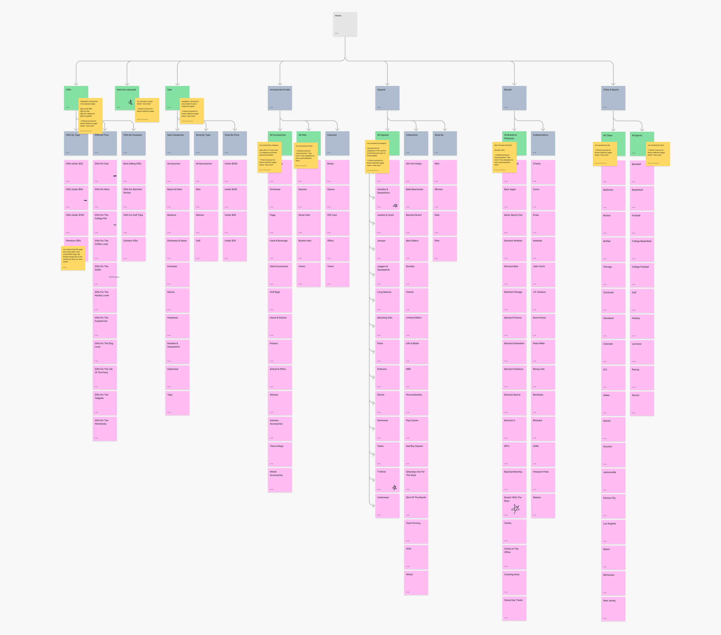
Next stepsWhat comes next?
With positive impact established it’s time to take our findings and start addressing other key areas of the store.
Taking a look at the sitemap primary navigation pages first will be prioritized first.
RetrospectiveFinal thoughts & takeaways
Working on this project with Barstool Sports was such a rewarding experience. The weekly comprehensive critiques allowed my designs to evolve from a few ideas to fully implemented in a matter of weeks.
1
Feedback early & often
With so many stakeholders involved (20+) it was imperative that we aligned regularly to ensure that everyone was on the same page.
Additionally, by syncing regularly everyone had the opportunity to voice their opinion and I was able modify the design with all angles considered.
2
Communication is key
Timelines were extremely tight in this project. I had to ruthlessly prioritize and communicate closely with the team in order to drive a successful product launch.
With that said, it is incredibly rewarding to know that thousands of customers are experincing my designs on a daily basis.